
UI/UX
Modern Web Design Trends Shaping 2026
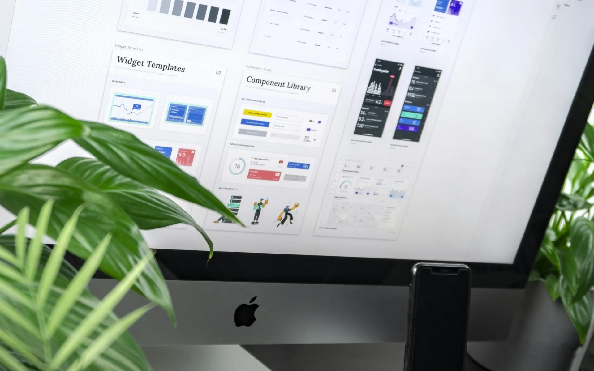
Design trends move fast, and most of them don't matter for your specific business. A handful, though, are shaping how premium websites actually look and feel this year — and they're worth understanding, if only to know which ones are worth adopting.
Restraint Over Maximalism
After a few years of increasingly loud, experimental interfaces, the sites that read as premium in 2026 tend to do less, more precisely: generous whitespace, a tight color palette used consistently, typography doing most of the visual heavy lifting instead of decoration. It's a harder discipline than it looks — restraint requires more design judgment than filling every inch of a page.
Motion With a Purpose
Animation hasn't gone away, but the "everything fades and slides in" era is being replaced by more purposeful motion: a hover state that clarifies what's clickable, a transition that helps a user understand where content came from, a scroll-triggered reveal that paces a long page instead of decorating it. The test that separates good motion from noise is simple — does removing it make the page harder to use, or just less busy?
Bespoke Typography as a Brand Signal
As more sites get built faster (with and without AI assistance), typography has become one of the clearest signals of whether a site was actually designed or assembled from a template. A well-chosen, well-paired type system — a distinctive display face for headlines, a highly readable body face, deliberate sizing and spacing — does more to make a site feel custom-built than almost any other single decision.
Dark Mode as a Default Consideration, Not an Afterthought
Supporting a dark theme is no longer a nice-to-have bolted on after launch — it's increasingly designed in from the start, with color tokens, contrast ratios, and imagery all planned to work in both modes. Sites that retrofit dark mode late tend to show it: washed-out images, text that fails contrast checks, components that were never designed with a dark background in mind.
Performance as a Design Constraint, Not an Engineering Afterthought
The best-designed sites this year treat page weight as a design constraint from day one — the same way a print designer works within a fixed page size. Every large image, every custom font, every animation library gets weighed against its cost. This mindset shift, more than any specific visual trend, is what separates sites that feel premium from sites that just look premium in a static screenshot but load slowly in practice.
Which of These Actually Apply to Your Site?
Not every trend fits every brand. The useful exercise isn't chasing what's current — it's asking which of these principles (restraint, purposeful motion, real typography, planned-for dark mode, performance as a constraint) would genuinely improve how your specific site communicates and converts, and building from there.
Curious how your site's design holds up against these ideas? Get in touch and we'll give you an honest take.
See these principles applied on our web design services page.